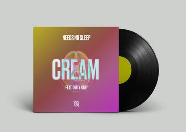
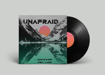
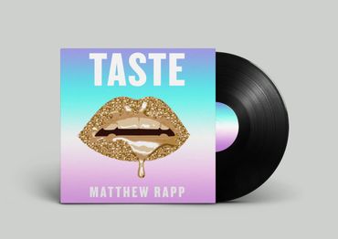
Phase One Co.
Package Design
Brief: While working at Phase One Co. A record label based out of New York City. I was designing album art, interactive promotional videos, merchandise , social media marketing collateral, and remodeling artist’s websites. Collateral such as IGTV videos, snap-chat geofilters, banners, timely posts, presets, etc. I created filters that were used at Summer Jam, a rap Music Festival. I was in charge of all design work for their two main labels: Uprise, an electronic dance music label, and EMG, a rap and hip hop label. I would sit in on photo shoots for press, adjusting lighting, studio operations, color balance, and other needs. Among working in a professional setting I would be responsible for leading creative meetings that were dealt in my labels.
Software: Adobe Illustrator | Adobe Indesign | Adobe Photoshop | Adobe After Effects

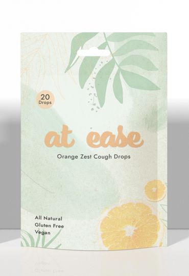
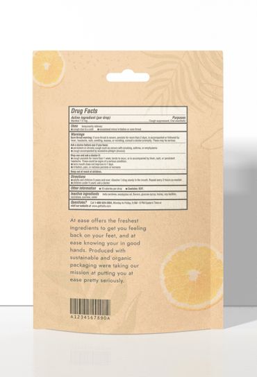
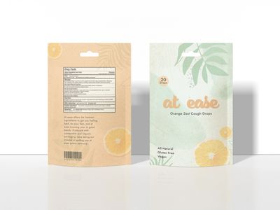
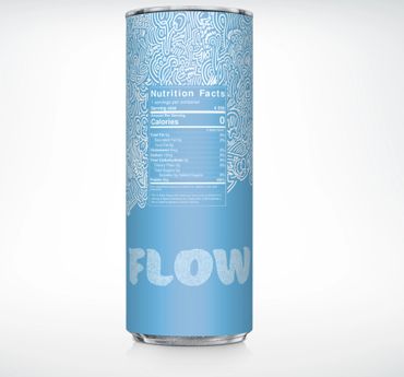
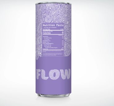
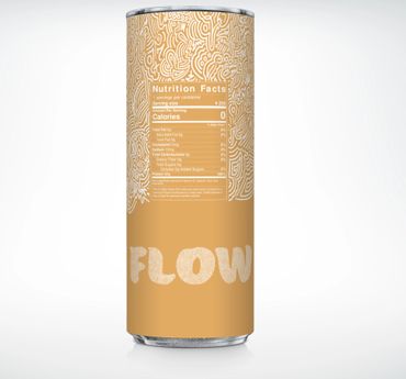
At Ease Cough Drops
Package Design
Brief: At ease is a concept design for organic cough drops. Made from the freshest ingredients to keep your mind, body, and soul at ease. I used Earth tones to keep a connection with the natural ingredients, and our primary clients. Using a hand drawn pattern creates a human connection between the buyer and the product. I kept the illustration full, but minimalistic at the same time. Designed to keep all senses of the consumer at ease from the feeling of the package, to the illustration, to the color theory. A challenge I faced when originally designing the packaging was keeping it consistent with the pattern and the brand.
Software: Adobe Illustrator | Adobe Photoshop | Adobe Indesign


Asana Health + Wellness Center
Brand Development
Brief: Asana is a Health and Wellness Center that uses CBD as its main ingredient to promote organic, and all natural spa services and products. The spas goal is to bring you, back to you; by embodying the art and science of botanical and plant derivatives. Asana creates a sustainable and positive impact on your body. The Spas botanical usage and design connects the primary audience to the products they’re using to Asanas core beliefs.
Asana embodies the art and science of botanical and plant derivatives. By combining natural elements to well known wellness practices it is creating a sustainable and positive impact on your body. A hand drawn illustration creates a human connection to the buyer and seller. Using the hemp leaf in the package it gives a sense of Hemp while being sly and minimalistic.
Software: Adobe Illustrator | Adobe Photoshop | Adobe Indesign
