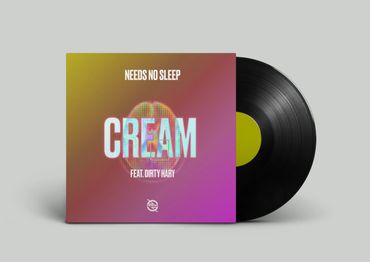
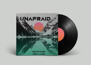
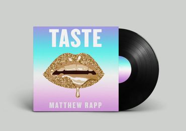
Cait Griffith

Cait Griffith Cait Griffith Cait Griffith
HOME
About
Branding + Design
Motion
Photography
Prints
Contact

Cait Griffith

Cait Griffith Cait Griffith Cait Griffith
HOME
About
Branding + Design
Motion
Photography
Prints
Contact
More
  • HOME
  • About
  • Branding + Design
  • Motion
  • Photography
  • Prints
  • Contact
  • HOME
  • About
  • Branding + Design
  • Motion
  • Photography
  • Prints
  • Contact

    1908 Brands- in house agency

    Content + Copy Creation | Social Media Direction

    Brands: Boulder Clean, Schult'z Gourmet, Pasta Jays 


    Brief: Visual and verbal content created and curated for marketing campaigns, product  launches, and brand direction.  


    Software:  Adobe Illustrator | Adobe Photoshop | Adobe LR | Hoot Suite | Asana | Later

    Burton Snowboards

    Product Design

    Brief: Inspired through the blueprints of color theory. Breaking apart the CMYK color and printing process. It is incorporated in a design standpoint that is pleasing to the unknown, as well as an “Ah-Ha” moment to the designers around the world. Choosing fluidity, repetition, and a focus in color theory it brings back the fundamental basics of art principles. 


    Software:  Adobe Illustrator | Adobe Photoshop 

    Dream Hotel Group

    Corporate Branding

    Brief: While working at Dream Hotel Group In NYC. She designed a quarterly brand guide for a new hotel property. The location: Salt Lake City, Utah. 


    Software: Adobe Illustrator | Adobe Indesign | Adobe Photoshop

    Cooper Hewitt

    Poster Design

    Brief: With a 48 hour time limit, the problem was to design a poster for Cooper Hewitt’s newest exhibit, “Nature By Design.” She chose to photo manipulate images to communicate both science and nature. Working together, these themes proved to be successful in both a cyan and a magenta. She kept the movement flowing through the poster to emphasize scientific nature of design as a whole, and to complete the exhibits true meaning. The abstract and vibrant design effectively off balance the negative space on the bottom of the poster. 


    Software: Adobe Illustrator | Adobe Indesign | Adobe Photoshop 

    Crop Sticks Sustainability Report

    Print Design

    Brief: Crop Sticks by Crop Made is a chopstick company that is almost completely sustainable by using and up-cycling bamboo. Designing a sustainability report communicates serious and factual information in a easy going and readable way to the viewer.


    Software: Adobe Indesign | Adobe Photoshop

      Blue Forest Farms

      CBD Tincture Package Design Rebrand 

      Uprise Records.

      Package Design

      Brief: NYC based record label.  Published and licensed album art, animated  promotional videos, merchandise, and other marketing content. Content: such as reels, tiktoks, snap-chat geofilters, banners, merchandise and more. 


      Software: Adobe Illustrator | Adobe Indesign | Adobe Photoshop | Adobe After Effects 
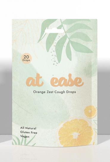
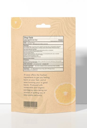
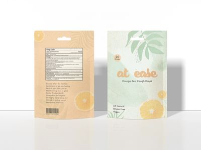
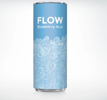
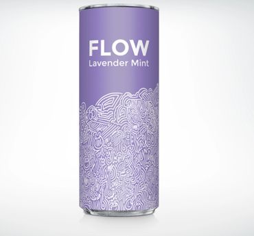
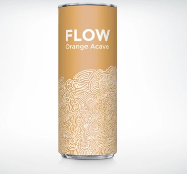
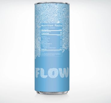
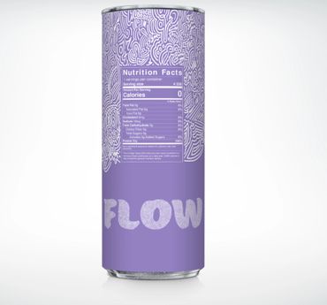
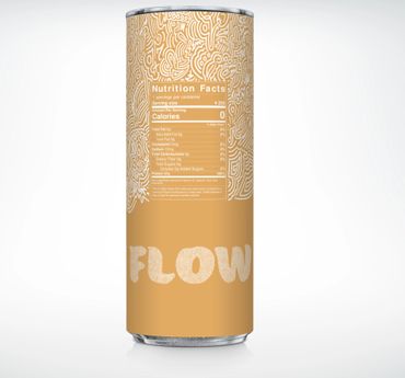
      At Ease Cough Drops

      Package Design

      Brief: At ease is a concept design for organic cough drops. Made from the freshest ingredients to keep your mind, body, and soul at ease. She used Earth tones to keep a connection with the natural ingredients, and our primary clients. Using a hand drawn pattern creates a human connection between the buyer and the product. She kept the illustration full, but minimalistic at the same time. Designed to keep all senses of the consumer at ease from the feeling of the package, to the illustration, to the color choices.


      Software: Adobe Illustrator | Adobe Photoshop | Adobe Indesign

      Flow Seltzer

      Package Design

      Brief: I had to brand, design, develop, and package a seltzer water company. In doing so, I wanted to keep the design to the companies core values. Flow was created to keep you going, and going with the flow. She chose to illustrate a continuous pattern around the entire box to show uniform, natural flow, and create an identity system. She used the pattern as a call to action to the consumer. The purpose is for the viewer to pick it up immediately, turn it around, follow the pattern, and understand everything the company is about all before putting it in their cart. By incorporating a pattern into the main logo she  wanted to keep the consistency strong throughout the whole box. My intention was to make it strong enough to stand alone without any other text, a halfway mark in between a symbol and stand alone type. 


      Software: Adobe Illustrator | Adobe Photoshop | Adobe Indesign | Procreate

      Copyright © 2018 Cait Griffith  - All Rights Reserved.


      contact@caitgriffith.com

      This website uses cookies.

      We use cookies to analyze website traffic and optimize your website experience. By accepting our use of cookies, your data will be aggregated with all other user data.

      Accept