
Burton Snowboards
Product Design
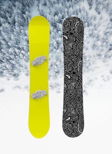
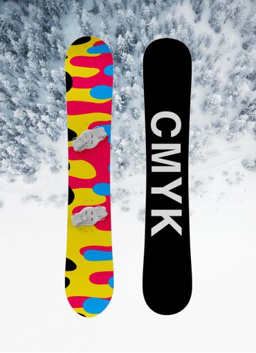
Brief: A set of concept snowboard designs inspired through the blueprints of color theory. Breaking apart CMYK and incorporating it in a design standpoint is something I wanted to be pleasing to the unknown, as well as an “Ah-Ha” moment to the designers around the world. Choosing fluidity, repetition, and color theory I wanted to bring back the fundamental basics of art school.
Software: Adobe Illustrator | Adobe Photoshop | Procreate
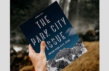
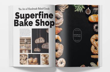
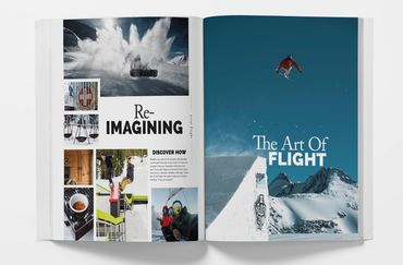
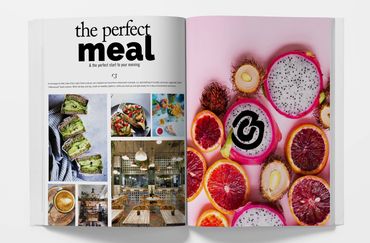
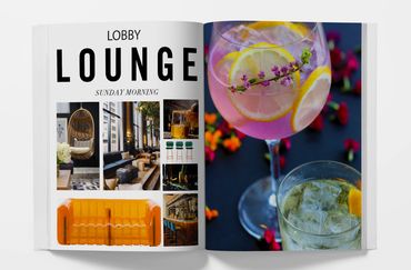
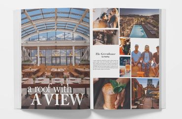
Dream Hotel Group
Corporate Branding
Brief: While working at Dream Hotel Group In NYC. I designed a quarterly brand guide for a new hotel location. My location: Salt Lake City, Utah. Having to brand a hotel from scratch while following corporate brand guidelines challengend me and taught me how to think outside the box while staying in the lines. Using full bleed images and spreads I wanted to give an experience to the viewer. Almost, as if they were already staying in the hotel.
Software: Adobe Illustrator | Adobe Indesign | Adobe Photoshop


Born Again Thrift
Logo Design
Brief: Commissioned freelance project. Client asked for a 70's retro vibe that incorporated reusing and recycling thrifted vintage clothing. Client was specific on the colors, but left the overall design freedom to myself.
Software: Adobe Illustrator
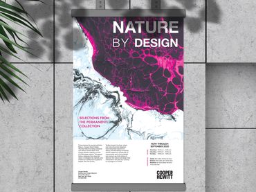
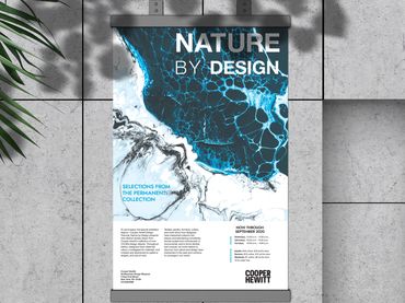
Cooper Hewitt
Poster Design
Brief: With a 48 hour time limit, the problem was to design a poster for Cooper Hewitt’s newest exhibit, “Nature By Design.” I chose to photo manipulate images to communicate both science and nature. Working together, these themes proved to be successful in both a cyan and a magenta. I kept the movement flowing through the poster to emphasize scientific nature of design as a whole, and to complete the exhibits true meaning. The abstract and vibrant design effectively off balance the negative space on the bottom of the poster.
Software: Adobe Illustrator | Adobe Indesign | Adobe Photoshop


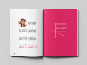
Nexus Art Magazine
Magazine Design
Brief: Nexus is a literary arts magazine that displays a variety of work including painting, drawing, photography and architecture, as well as short stories and poems. The goal of this project was to present the information in a logical and visually appealing manner. I chose to showcase work from women that live in Colorado to add a personal and local element. The magazine I designed has a modern/eccentric vibe because design and art is ever-changing. Designed to be seen as a whole, and not individual pieces, I kept the entirety of the magazine black and white, with the exception of the feature article to add emphasis to the artist. I enjoyed working with line art and exploring illustrative design in a minimalistic matter.
Software: Adobe Illustrator | Adobe Indesign | Adobe Photoshop | Procreate
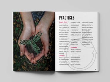
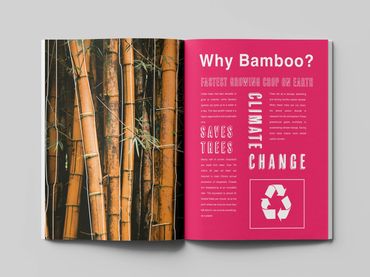
Crop Sticks Sustainability Report
Infographic Design
Brief: Crop Sticks by Crop Made is a chopstick company that is almost completely sustainable by using and up-cycling bamboo. Bamboo is the fastest growing crop in the world. Designing a sustainability report produced to be challenging to communicate serious and factual information in a easy going and readable way. I kept the theme of bamboo repeating through the report by using patterning as well as keeping it exciting by using a non-typical color when usually talking about bamboo: pink.
Software: Adobe Indesign | Adobe Photoshop